Saturday 26 December 2009

Under the influence of Paul Price..


I definitely did take one look at him with this book, think it was incredibly cool, then take it out of the library myself. What can I say, the man has good taste in knowledge?

The book is actually amazing, it makes you so badly want to be the best at what you do in the hope that your work turns out something like this. I never want to have to give it back to the library and so I'm considering investing some non-existent money into my own copy.

I'd highly recommend it to anyone looking for a fresh alternative to graphic design!

Commissioned Paintings

With the aim of trying my hand a a wide range of disciplines in this module I decided to try my hand at painting again. Both of my parents have been badgering me for a while to paint them pictures but despite being offered money I've just been too lazy to actually go out, buy the canvases and paints, then actually sit down and do them - a shockingly poor excuse. But under the umbrella of 'christmas presents' I managed to pluck some sort of motivation.

I know this is a very vague idea of a 'brief' but I still think it's relevant to the Visual Language module - the whole point is that I find some sort of personality as a designer and who's to say that painting/fine art isn't a part of that?

My mam wanted a big canvas of 'something pretty' to go in her newly decorated sitting room. She already has some floral photographs on her walls so I assumed that she wanted to stick with that sort of theme. The room is decorated in teal blue, light grey and black trimmings so my colour scheme had to incorporate that. I started scribbling some simple flower drawings down and within about 10 minutes I knew the sort of thing I was going to paint and this is the outcome:


My mam seems to really like it and it goes well in the sitting room and it is really pretty but if I'm honest I got no sense of satisfaction out of painting this image and I couldn't quite figure out why. It made me feel indifferent and didn't really help me to understand my relationship to painting any better..

I'd already determined in my head that I was painting my dad a canvas for Christmas without considering any other possible gift options and so it was only at the last minute I realised I hadn't actually ever asked him what it was that he wanted. I don't know exactly what I was expecting him to say but I'm telling you right now it definitely wasn't this...


Yeah guys that is Valentino Rossi wearing a helmet depicting Donkey from Shrek. Errrrmmmm and I was expected to paint this??? I used to be a dab hand with a paintbrush back in school but I think this was a tad optimistic.. Having already accepted the fact that this was never going to end well and pre-warning my dad not to get his hopes up I bought a canvas with the logic 'you never know if you don't try'.

I drew it out. So far so good. Painted my first square inch. Not so bad. Nine hours later I had myself a masterpiece on my hands! It's by no means perfect but safe to say I'm fairly proud of myself.


Despite having studied art all through my education and receiving consistently high grades I've never considered myself to be a 'fine artist'. I do love it, and I think I'd be quite good at it but I could never really commit to it because of the stigma of job insecurity. I don't think I have enough confidence in myself to erect a career solely from my own creative output - which I now ironically realise is the case across all design disciplines but I think as an artist there is so much more pressure.

Because of my initial apprehensions towards this image I now feel a much stronger sense of achievement. I produced an image based on someone else's requests rather than my own and because a lot of the creative responsibility had been taken away my main concern was to focus on the quality of my painting. This was something I never, ever, in a million years, would have done off my own back and this made it challenging for me. I think when we are challenged it provokes us to do our best.. now I just need to apply this logic to the rest of my briefs!

Friday 18 December 2009

Laser Cutter Induction

Despite dragging me into uni after officially finishing for Christmas, I did actually find the whole thing pretty interesting. It's actually really simple to use and the diversity of outcomes is incredible. You can import files straight from illustrator into the laser cutter software which makes things ridiculously easy, then it's just a case of clarifying the type of cut you want for each of the lines. There's presets for about 40 different materials on there already and we were shown how to make and save our own - the main thing to consider with this piece of equipment is that it's fairly reliant on experimentation so don't count on producing an immaculate finished piece first time round, it will take a few goes. Definitely going to come in handy in the future, I'll make sure of it.

I was going to take a photo of the little test piece we all made but it seems to have temporarily escaped my vision, sneaky sneaky.

Thursday 17 December 2009

Christmas Perfection

One night. Two girls. The Santa Claus movie on repeat. And this selection of unsuspecting festive fancies..


Exhibition Piece

Got my screen print on in a big way! Spent yesturday morning at Vernon St with the print room alllllllll to myself for most of it, it was heaven. Roger helped me with my post-it printing, which turned out to be a lot more tricky than first anticipated. Even though the software made sure that the colour separations were perfectly aligned when I printed them out to scale, the fact that printing involves some degree of heat means that there will always be a slight case of warping. Brilliant. To get round this I (and by 'I' do mean Roger) had to tape the sheet with the background positives down to the light box, cut the drawing positives into 3 separate pieces, align each one individually then re-stick the 3 back together as one whole sheet. Then I could expose them. HELLO another problem. Because I'd printed my positives onto tracing paper to save costs on such a large print out, I could only expose my screens for 7 light units otherwise I'd lose my image to overexposure. Fantastic. So once I'd exposed them both for 7, gently rinsed them both down and left them both to dry I had to post-harden them for a further 100 light units to try and muster some longevity. A painfully tedious process. It's a good job I only wanted to print a few out because after about 5 runs the emulsion did actually start to degrade, and tape can only salvage so much.

I also got to experiment with some canaletto paper - sweet as a cashew nut. It cost £1.80 per sheet but SHIT ME, THAT'S UNPRECEDENTED SMOOTHNESS! Printed like a dream, no word of a lie.

Here's a nice picture of my pretties, the blue shows up much better in real life, the flash on my camera did it no favors I'm afraid. It's not perfectly aligned but the paleness of the background makes it a lot less noticeable. Most importantly I've identified the problems and understand how to ensure they don't happen again, boom.


Penguin Book Awards


The children's book category of the Penguin Book Design competition this year is the redesign of Alice's Adventures in Wonderland by Lewis Carrol. The main focus is on typography, which is something I'd quite like to get into so I'm going to work on an entry. Here are a few pages from my sketchbook - only after completing the spider diagram did I realise that everything I was brainstorming was a literal part of the story and therefore irrelevant if I wanted to produce something innovative, joys.

I very rarely write in one direction on a page.. apologies for the difficulty reading!

Send and Receive Presentations

I've never really been afraid of presentations; I feel pretty comfortable speaking in front of people, and because we weren't required to create any visual elements for our presentations I was surprisingly unfazed by the whole idea. Worryingly calm, when I think about it - no preparation, I just explained what I was doing, what I've been reading and how the two are relevant to me as a visual communicator. In hindsight after I'd sat through people who had notes and Powerpoints I felt mildly concerned that mine was nothing like a presentation at all.. So it's either a really good thing that I can just rattle off a 5 minute speech from the top of my head, or a really bad thing that I put minimal effort into something that's contributing to our marks? Like I said, worryingly calm.

One thing I will say is that this was the first lot of presentations we've had to sit through where I've genuinely been interested in what every single person has had to say - not implying that the work has been bad on previous occasions, simply that the diversity of our send and receive projects was intriguing. Everyone was really passionate about the projects they're doing and each individual communicated their ideas with clarity and enthusiasm. We appear to have collectively pulled our fingers out.

Monday 14 December 2009

Colour Separation

Before I get round to screen printing my illustration I need to master this colour separation nonsense. I know I've been shown how to do it before in the design for print workshop with Mike Flower but very rarely do I store any of that information long term - it's just too much to take in. Since I was working from home I didn't have the option of running to the technicians so I jumped on the Youtube tutorial bandwagon. This video explains it in a really simple way, I think, and it's definitely something I'm keeping for future reference.

Viscom Illustration Exhibition

Finally manned up and tackled Illustrator head on. And by that I do mean I went running to the technicians for help of course. They are lovely. This is the image that I want to submit for the exhibition...

I want to screen print it onto A2 or A1 paper, I'm undecided at the minute, because it's a vector image it will be the same quality either way. Obstacles that I face now: figuring out how to magic some colour separation; printing out A2 or larger, that means venturing to the digital print room, scary; screen printing the image and getting the two separations perfectly aligned - it's gunna be pretty grim, let's face it.

Wednesday 9 December 2009

New Shoes...


Today, these beautiful creations entered my life... They make my heart happy.

Tuesday 8 December 2009

Viscom Illustration Exhibition - Take 2


For the illustration exhibition I've developed my post-it notes drawing further by creating a sequence illustrating 3 points of the flip-book animation. I intend to screen print them in a vertical line each with a light blue background. This means I have to bite the bullet and try and get some Illustrator literacy. Awesome.

LCC Christmas Show

Holy shit, it was incredible. I spent 5 hours solid chasing after kids; trying, and failing, to muster some sort of order. My bones ache, my throat hurst and I'm pretty sure I still have face paint plastered on my neck but it was honestly so much fun. My main jobs were to make sure that all 30ish kids were suitable costumed up from the extensive fancy dress collection, then send them off to face paint. Sounds relatively easy but in actual fact proved to be a ridiculous task - they have a tendency to not stand still for prolonged periods of time. Rascals. Of course I was dressed in suitable attire as well - a nice oversized jazz-tastic blazer and some rather fetching clown make-up.

Once the aesthetics had been taken care of we had a dress rehearsal, which if I'm honest probably couldn't have been more hectic, slightly worrying to say the least. Daryll hackett, the professional performer, arrived; the caterers started to set up shop; the audience had to be greeted; then show time! During the show it was my job as 'keeper of the mats' to make sure that crash mats and roll mats were on stage when needed, I pretty much had that one down I reckon. During the interval I managed to score a cup of tea and a hot dog, then someone threw a vegetable samosa my way and it kept me content.

The second half of the show was much less stressful as all the kids had performed their acts and it was their turn to watch Daryll's performance - shit me, the man is funny! He has the sort of humor that entertains kids to no end but a lot of it has a lower level aimed at adults, it was wicked.

When everything was finished I was amazed to see how many parents stayed behind to help tidy up. There's a real sense of collectivity amongst the children's circus that's pretty overwhelming. There's also been a number of thank you letters/emails forwarded to all the volunteers as well, from what I gather the parents are so appreciative of the opportunities available to theirs kids at circus - I know when I was little my parents never wrote thank you letters to any of the clubs I went to?? Something that also took us by surprise was the turn out, someone counted just over 100 people in the audience at one point which is way more people than we had chairs - evidently LCC is doing something right!


Monday 7 December 2009

Yeah, erm, guys..


Bookbinding

Nice little bookbinding session with Roger down at Vernon St. I seemed to be the only one who knew what they wanted to learn.. As it stands I plan on compiling all the briefs I manage to do for this project in a small book. The focus of the book will be the layout and not the binding techniques - that way the book design itself becomes part of the collection of 'live' briefs. Lovely old job.

To keep the book simple I wanted to learn how to make a soft back book, with a cover made from thin card that I could easily screen print onto, instead of the hefty hardback books that we made for reportage last year.

It was actually really easy to make, just a bit tedious waiting for the glue to dry. Something I've definitely taken from yesturday is that I seem to work a lot quicker than a lot of people, best part of my day was spent waiting for others to catch up. If I need to have another bookbinding session in future I'll probably work in a much smaller group, or perhaps even on a one to one basis.

Sunday 6 December 2009

Don't Panic - Value Poster

Well. Paul should start charging people to be his friends, the man saved my life (in an overly dramatic graphic design related manner, of course). Had a nice little graphics 101 in his lovely - and by lovely I do mean terrifying - house. I'm now boasting a remedial amount of design wisdom that includes the circles and page breaks trend that I have appeared to hopped on the band wagon of. Here is my post-Price poster, pretty slicckkk!


It can also be found here on the Don't Panic website, but the voting hasn't started yet. Judging by the other entries I don't think I'll win it. I'm really pleased with my design but the caliber of posters uploaded at the minute is pretty grim to be honest and it looks as though it's any ounce of conceptualism is going to be lost on this audience - I'm up against a bulimic fly reference and a guy that drew a robot on paint? Have some respect for GOD'S SAKE PEOPLE! I think in this case it's been about dealing with the pressure of an exceptionally short deadline and getting to grips with graphics again more than anything else - although winning would be nice. But if I lose to an self-pitying fly lover then it's a stupid fucking competition anyway! Hahhhhhh =P

*Something inexplicable has happened to my layout????

Friday 4 December 2009

Don't Panic - Value Poster Development


After some pretty intense brain storming I settled on the concept of 'value' in terms of a designers moral responsibility. In the Enterprise session the other day it came up in conversation that the design industry is the largest consumer of paper out of all the business sectors, which I chose to play on in this poster. I began to come up with ideas around 'designer waste' - designer in the sense of produced by a designer, and also in the sense of being highly regarded, or 'cool'.

All of my thought processes are in my sketchbook, this is just a summary so I appreciate that some things will appear quite random.

For my poster I'm going to be using typography. The main focus will be the phrase 'designer waste' and the fill of the letters will consist of images of the notes/documents/drawings etc that I, personally, have discarded - my designer waste, get it?

Playing around with type layout - I settled on this for the final composition of the text:


The idea is that each letter looks like this (only better, this is just rough):


Collected my images and used them as fill for the text, I had a limited number of coloured scraps so I decided to use them to highlight the word 'waste', gives it more emphasis and brings it to life a bit more. Still has a dull element to the image here so I've added a drop shadow:


To give it context I plan on including the statistic from my research - "paper manufacturing is the 3rd largest user of fossil fuels worldwide", it has to be inconspicuous compared to the jazzy title. I want the symbol of '3rd' to be the focal point of this text as numerical values and rankings cause curiosity and because the symbol is only 3 characters long I'll be able to have it relatively larger than a whole word or phrase. I'm really struggling with layouts at the minute though, I just can't come up with anything that feels right. The shape of the words just don't seem to fit into any sort of flowing composition.. I think the grey works better than the black though, but then again what do I know? I'm also struggling to settle on the typeface of the sentence. The title letters and '3rd' are Impact (I'm going through some sort of phase?) but I don't know if that's too heavy for the full sentence... Aaarrghhh.


**The grey borders aren't on the actual poster its just the print screen from Photoshop!**

Wednesday 2 December 2009

Viscom Illustration Exhibition

The exhibition that's being organised by Paul, Jodie and Holly is a really useful opportunity for me to get some of my work shown so when I received the email I began thinking about possible work that I could submit.

'Work can be old or new'.. well considering I haven't really done any work on this course so far that could be classed as illustration I'm definitely going to have to produce something new.. The work has to be submitted by December 9th, that gives me a week... Then I had that horrible I-can't-deal-with-the-randomness-of-self-generated-content fiasco again where I was just had to ask myself what the hell am I going to illustrate?

I considered developing my 'handbag collection' a little bit further (because, surprisingly, people liked the drawings I'd done so far in the crit today) and maybe submitting a sequence, but then I reminded myself that I hated it 24 hours ago so it's inevitable that I'd end up hating it again..

I had a quick peruse on the web for live briefs, not expecting to find anything useful, but the latest Don't Panic poster competition is coming up and the deadline for that is December 7th - so if I get something done on time for that then I can submit it to the Paul, Jodie and Holly's exhibition as well! That way I kill two birds with one stone - some sort of live brief as part of my visual language and a contribution to the exhibition. Sounds good in theory.

The Don't Panic brief this time around has a theme of "Value" - so create a poster through any means that captures this theme. So I've been brain storming and throwing out ideas in my sketchbook (which I'll scan in later and post because my though processes are too lengthy to explain in full) and although I came up with some illustration ideas I seem to have settled on the idea of values in terms of a designers moral viewpoint - things like design for social change as stated in First Things First Manifesto, eco-friendly design to do with inks and papers and also acknowledgement of waste and by-products. From this I've chosen to develop the idea of 'designer waste' - I was told yesturday that the design industry is has the largest paper consumption of all the business sectors.

And... I've done that thing again...

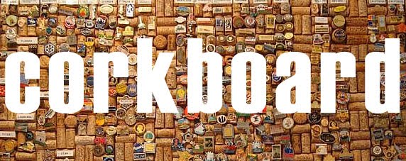
Where I say I'm going to do illustration but end up being pulled in another direction... The ideas that I have for my poster are now revolving around creating typography from the documents discarded by designers - i.e. LCA students. I don't really know how to explain myself properly but at the minute I see it being created through photography and ending up being more like graphic design than illustration so I don't think I'll be able to submit it for the exhibition.

Nevertheless, I'm still going to complete this brief in time to submit in on Monday because I really want to get stuck in as part of Visual Language and there's no time like the present really. I'll run it by the guys that are organising the exhibition and if it comes down to it then I will create a piece based on my initial collections idea, it won't be the end of the world!

Christmas at 30 Kendal Lane

Given the fact that everyone goes home for christmas we saw fit to break our tree out on December 1st. The 7ft tree, 2 boxes of decorations and endless fairy lights were a donation from my dad and his girlfriend as they have apparently upgraded. Our aim was to cover the whole tree, none of this 'colour scheme' shit either. We definitely beat the shit out of student Christmas.


Had a minor issue with the porcelain face being smashed off the angel. Not to worry, I gave her a facelift.


Pop-Up Museum

Took a gander at the pop-up museum in the Merrion Centre. It was pretty jazzy, not that much content but the atmosphere was great and the smoked salmon and cream cheese mini bagels were fucking sweet. It'll be interesting to see how popular it becomes.


The highlight was definitely decorating the paper mache letters as part of the 3rd years' contribution to the cause. CCCChris and CCCClaire decided to get on the letter 'C' - get it? It wasn't a competition but I definitely think we won.... :)


Tuesday 1 December 2009

Discarded Idea


These are the beginnings of my 'illustrate the random objects that have collected in my handbag' idea.

I'm not a massive fan of the drawings but they do look a lot better after being scanned. The idea was to really jazz up the backgrounds, I might still do it on one of them as part of my new 'making friends with Illustrator' outlook, who knows.

Yet Another Change of Direction...

I tried to run with the idea of having shit work to show at the crit being better than having no work but a quite complex though process... truth be told didn't work out so well for me. I'm not going to lie, I just felt shit because my work was shit and I wasn't happy doing it. So, yet again, a conversation with Christian went a little something like this:

"Christian, I have NO idea what to do for collections, I'm creatively retarded."

"Well, ignore the brief completely, what do you want to do?"

"Competition briefs..."

"Well go do that then."

The man talks a lot of sense. So much fucking sense.