Thursday, 28 January 2010

Insane Typography Skills


A celebratory post-exhibition trip to Wagamamas took a nose dive when I began to fashion Helvetica with left over sticky rice. Sorry guys.

Safe to say this picture message had very few typographical connotations in the eyes of my mother, if only she knew.

Illustration


Here are the final illustrations for my collections book. I definitely feel I have let myself down by setting my expectations too high for such a short period of time. I would have loved to have 10 drawings completed but I physically just can't draw fast enough! The most I could manage was 5, plus the illustration depicting the spine of the magazine. Up until now this was something I had never considered including however I think that by using this as a page of my book it will definitely help apply some context to it. I had previously toyed with the idea of including a short text narrative as an introduction on the first page but I really didn't want to have to explain my work - it should be able to stand it's own ground! I feel that this spine image does that in a way that does not detract away from the drawings.

Another thing that I've added to the drawings is the idea of the previous pages. By simply adding a small section of sporadic linear marks down one side of the page I have helped to strengthen the idea that my drawings are of magazine pages as objects, not as photographs. Even though it is only a relatively minor adjustment I think it definitely helps to cement the right idea in the mind of the reader.

Wall Pieces


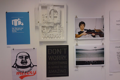
Here are some images of my work from the exhibition. Over all I think the work looks pretty good, I'm particularly proud of my 3D frame piece, all the effort I put in definitely paid off. I can't decide how well I think it goes with the work hung beside it, I don't think it's been done any favours having been surrounded by graphic design but maybe that makes it stand out more? Like I said, I'm on the fence and it wasn't my wall to curate! I'm just being picky.

My Vogue illustration was complimented so nicely on a wall full of photography. It brought variety to the wall and helped break the work up in a manner that was easy on the eyes, and the fact that it was a pencil drawing did this in a very subtle way. I think I made the right choice with framing it as well. The expansive black mount board really draws the eye to the centre of the frame and the softness of the drawing.

Exhibition Day


I feel numb; completely and utterly drained.

Curation:-
I really enjoyed being part of the curation team, me and Claire joined forces to tackle wall #3 - the biggest wall in the far corner of the main studio - and I reckon we earned our keep there. I never expected it to be that difficult! But trying to select 11 pieces objectively that compliment each other and work well as a collection is surprisingly tricky, especially when there's a room full of people trying to do the same - it takes really quick thinking and nimble footwork to nab the best pieces for the job.
Because we were dealing with the first wall that you see when you walk in the room the pieces had to be bold enough and good enough to warrant the audiences attention. We opted for mostly colourful pieces revolving around the large bear illustration which really brought out the warm colours in the other work. We decided on a tapered layout on the wall to direct attention to Steph's photograph, which we thought was the strongest piece on our wall.

Hanging:-
Having a plan is all well and good but erm, where do you start?? Most of our hanging time was spent gawping at the dirty white wall. Then we painted it. Then we gawped again. After some eye glazing and head scratching I made an executive decision to hammer a nail and BOOM we're on fire. Once you have the first piece up it's just a case of constructing the whole thing around it but the fear of getting right to the end and realising that you should have positioned the first piece about 20cm to the left is frankly, at the time, horrifying. Luckily we seemed to have cracked it first time and I think our wall looks pretty amazing! Team Bellia/Gauntley is go.

The weird thing is that whenever any of my friends were looking round I was quicker to point out the wall that we'd curated than my own work in the exhibition. Hmmm need to sort that one out.

Completion:-
The final thing worked so well. The salon style made it work as a whole so much better than individual workspaces ever could. There is the issue of the sporadic composition removing context from a lot of people's work and making it much harder for those 3rd years involved in things like community practice to show off their work but I think the main point to remember is that this wasn't a graduate show - it was simply to exhibit Viscom as a whole, each student had set guidelines to meet for this show and will have the opportunity to exhibit anything outside of those in their graduate exhibition that they will curate themselves. In short, we compromised the minority for the sake of the greater good I suppose. And we made the right decision.


There was so much positive feedback; it felt so good! I physically can't talk about this anymore. Everything hurts and my pillow has never screamed my name louder.


Wednesday, 27 January 2010

One Day To Go...


Wow, what a lovely and not at all stressful day. Oh wait I'm thinking of a day that wasn't today.

Laser Cutter:-
Got there just before 8:30 to make the most of my 9-10am slot thinking that I'd be lucky if I even got one of my larger frames cut out. I'd noticed yesturday that the cutter was going round each line more times than it needed to so I checked the settings of the 'mount board' preset and it was actually having 7 passes on each line... Errrrrm, hello unnecessary. I dropped that down to 3 passes and the difference was incredible. Not only did I manage to get my two remaining frames cut out but I also had time to redo the one I had to compromise due to lack of time. WHY DIDN'T I DO THIS EARLIER?!
So, in short, I got my frames cut out.


Business Lecture:-
I'm going to hold my tongue here.

Prep For Exhibition:-
  • painted all my frames white to make them an identical match to the box frame.
  • bought and attached mirror plates - I definitely think string would have been the choice of a fool.
  • bought a plain black frame large enough to house one of my Vogue drawings without me having to cut them down since I haven't decided the exact dimensions of the pages, and cut some black mount board down to size.
  • cut my post cards down to size - somebody please appreciate how difficult it is to perfectly centre an image that you CANNOT EVEN SEE. Bloody embossing and it's lack of bloody lines.
  • ate lots of food. Pretty sure Paul had a hallucinogenic level of sugar.
  • spent quite a while modifying the layout of my 3D frames, it's really hard to stick to my initial plan because you can't visualise it properly when you're working in 2 dimensions. My original layout plan just didn't work when I had the physical frames there in front of me, so I've adapted the fluid diagonal motion of the layout into a movement that starts at the very back and actually works its way out of the box frame.
  • constructed the whole thing. Took so long. I had to check and double check everything because I'd spent so much time getting everything ready I really didn't want to go hammering a fucking massive nail in the wrong place and screwing it all up. It was also ridiculously time consuming to try and match the height levels of each layer of screws - since I only had 3 variations of screw height some initiative came into play on my part and I had to build up layers with tiny blocks of foam board glued to screw heads
  • try and choose which drawing to put in my collections frame. The 'dash' drawing is so much better in my eyes but I really don't think it has the ability to stand as a single piece - there is no context and it just looks completely random. The 'wonderful' drawing, however, I like comparatively less but because of the hint at the word 'vogue' it will hopefully be much less confusing. I'm still on the fence with this one.. I don't think I'll have a decision until I'm forced to choose at 9:30 tomorrow..
  • helped Paul mount some signage for the exhibition tomorrow.


Complete Failure:-
So... yeah the whole embossing of the leather saga.. I visited Vernon St to see if it would actually be possible to leave my cover in the pneumatic press for a prolonged period of time. Turns out it is not. They've never tried it but they can't guarantee the effect the incredible amounts of pressure will have on the press over such a long time and they aren't willing to risk it. Fair enough. But that does leave me in quite a pickle. I can do one of two things:
  • stick with the leather covering and leave the current, vaguely embossed image to fully relax out so that the box cover is plain - then emboss a loose sheet of black card to act as a cover sheet inside.
  • completely make the whole thing again, scrapping the leather idea and opting for black buckram which we know will hold the embossed image perfectly.
God I hate it when things fail. I got really attached to the idea of a leather bound box, it looks so professional. But with such a large surface area on the cover I literally can't not have anything on there or it will just look amateur as fuck. It really pains me to say this, but buckram it is :(


When I type it out it doesn't sound like a lot but DAMNIT IT WAS GRIM!

Tuesday, 26 January 2010

Embossing

As I had feared my multi-depth postcard idea was a tad ambitious. It could be done, but I would have had to stay there throughout the whole 6 hour acid bath and black out a frame every few hours so that it stopped eroding the copper. That was 6 hours I didn't have. So I settled for the single frame, which to be honest I now think was a better choice anyway - because the embossing is so subtle it would have just been crazy on the eyes if I had too much detail.

I did a test emboss on cartridge paper and it worked perfectly but it was generally a bit flimsy and crap for a postcard - I got on the good stuff: canaletto paper. Worked like a charm, sexiest piece of paper I have ever laid my eyes upon. I made 12 to start off with as the pneumatic press was rather laborious and time consuming - I just need to cut them down to size and they're good to go!

I also created the embossing plate for the cover of my book box. Yey I love spending nearly £15 on copper! Oh no wait, that's right I don't. I used the image with the black text to make the plate, then once the erosion was complete I trimmed the plate down to the black edges of the border to make it easier to align.

I whacked some of my faux leather fabric onto some grey board and did a test run - worked a treat so I stuck the plate on top of my bound cover and threw it in the press. While I was pumping the press up, I noticed that the previously sharp, crisp lines of the embossing on the test piece had relaxed an obscene amount due to the elasticity of the leather. DAMN YOU SPRINGY SURFACES. So I majorly increased the pressure of my cover press and prayed. It came out. All seemed fine. Lovely sharp edges. So I took it away and walked up to Blehiem - by the time I got the the same thing had happened. I spent so long trying to make this look perfect and professional and everything just keeps going down the shitter, fantastic.

It's a really good job I anticipated this and purposely chose not to bind the cover to the tray/lid of the box. This means I can retry next week. I think I need to take a much more aggressive approach to make it permanent - I've done a bit of research and I can't find definitive instructions for faux leather but for real leather to permanently emboss it you need to dampen it, heat it up and leave it in the press for at least 6 hours. So I think an overnight job is in order.

Thomas Chippendale


Since I've spent a lot of time in the 3D workshop recently, I've been talking to the technicians quite a bit. One of them took a look at my work and suggested I look at Thomas Chippendale, an 18th Century cabinet-maker who was commissioned to produce pieces for most of the aristocratic houses of the time. Above is an example of his work in the form of a four poster bed designed for King George III - although it is not a frame, you can definitely see how the intricate detail would be something that could easily influence my work. As my wall piece is focused on really ornate frames it is quite fitting to look at Chippendale's furniture as he was one of the most sought after British designers in an era that thrived on elaborate decoration. Had I known about him before I started drawing out the frames then I suspect my piece would have looked a lot different. I hate how many times this brief insists on kicking me when I'm down.

Sunday, 24 January 2010

Postcard

Sticking with the same underlying idea as the wall piece, which is the creation of depth and imagery without actually resorting to mark making, I want my postcard to be produced through embossing - again incorporating the images of the frames.

As stated in my last post I don't know exactly what embossing entails and what I'd be able to do with it. I've been having a plan around with some layout ideas and I really hope that it's possible to achieve a variety of depths on one plate. From my understanding making an embossing is the same as making an etching plate, only you leave it in the acid for much longer? In which case I would imagine that different shades of black/grey will achieve different degrees of erosion and therefore varying depths.

Ifff this is right, then I'm aiming for the image below, if not then I'm going to have to settle for a single frame. Hopefully it will still look quite interesting but I'm pinning my hopes on the overlapping idea.


Box Cover

My collection of Vogue illustrations are now going to be presented in a book box so I've been thinking about the cover and the effect I want it to have. I've decided to call my book 'My Vogue' because that is essentially what it is - a collection of drawings of pages taken from my collection of Vogue, and the images I've drawn are a representation of the things that I, personally, see.

I started constructing the box this week but I could only go so far without having the materials to cover it; they only have buckram and I quite fancy leather. There's drop in tomorrow so hopefully I can crack on with it tomorrow.

I want to emboss the cover because I obviously need to include a title and my name but I'm not keen on sleeves and I don't really think you can print onto leather.. I'm having difficulty designing the cover because I don't know exactly how embossing works - will the content in black be indented? Will it be put through the press with the plate on the top or the bottom?

I've made two designs to cove both bases - the first is imagining that the black will be embedded inwards, and the second is if the black is raised from the page.


Saturday, 23 January 2010

Deep/Shallow Learning

I've done this whole module so backwards. I'm really happy that I'm doing loads of work that I'm actually enjoying and excited about but everything is so messed uppp! I've realised so many things that would have been immensely useful to have understood at the beginning.

Spent way too much time pissing my efforts away on random pointless pieces of work. Then realised that I wanted to do the fashion illustrations.

I've been manically trying to get all of this work done and now that I know what I'm actually doing I'm looking at it and thinking 'man if I had just decided on this at the beginning instead of pissing away my time on random briefs then I could potentially make some fucking amazing work'. It sucks so bad. What's pissing me off the most is the fact that the wall piece/postcard were just an idea decided upon on a whim purely because I had to have something I wasn't considering my visual language much - there was no purpose behind them, no reason, just something I could rustle up that wouldn't distract too much time away from the drawings since they're so time consuming. But now that I've started it, the idea of going back and having to spend time on the 'book' element is so unappealing.

Due to the fact that I wasn't majorly concerned about the wall piece/post card element I didn't really put much thought into it in the beginning which is really bugging me now. I should have done all of this research into frames and made that my collections submission and not my drawings. I'm still happy with the work that I'm doing/done but seriously hindsight is a mother fucker.

The frame idea would have been perfect for collections for so many reasons. Undeniable ties to museums, galleries and curation. They are used as a fundamental tool to present collections of objects. They have an history just as intricate as the art they hold. They themselves are often of more interest than the art within a collection and, whether actively or not, each museum/gallery hold their own collection of frames. There are countless angles I could have taken.

I suppose this still all counts because I've it's still within my collections brief, just not in my book, but the wall piece and the postcard are only meant to take up 25% of our time and it would have been nice to realise the potential in this idea sooner and be able to develop it further.

I briefly mentioned before that this originally had no consideration of my visual language at all. However because the idea was so simple - 'frames' - I've been subconsciously developing this in a way that's reflective of who I am and how I work. I've tied in my ideas from the D&AD development involving no mark making and it arose from an element of my collections book work. So even though I thought it was irrelevant, it's actually an example of my visual language starting to come through without having to force or over think it. This is the sort of work that I enjoy and this module has helped me realise that.

Frame Sizing

I'm quite fond of this arrangement, it definitely looks much better to vary the range of sizes and the way they seem to crawl across the frame is quite nice as well. Obviously I can't decide on a definite layout until I've cut them out but I reckon something like this would go down a treat.


Wall Piece Development

I managed to fix all my Illustrator files today. One thing off the list. I'm pretty sure that I went such a long way around it but I'm finally starting to get to grips with Illustrator, thank god. I realise now though that to save myself an unimaginable amount of time I should have avoided live trace altogether and manually traced the lines with anchor points. Wow hindsight is a mother fucker.

I want to be a lot more prepared when I turn up for the cutting session on Monday so I need to have the files sized correctly to save time. My predicament now though, is that I've made the illustrations quicker to cut out, but because I'm having less they will consequently need to be bigger which will essentially take more time. I need to get a balance of size/time.

I've been toying around with rough sizes on Photoshop to help get a better idea of the final visual:


Laser Cutter and Wall Piece Development

So today I went to cut some stuff with lasers and what not. It was a roller-coaster of emotions ranging from giddy delirium brought on by the initial novelty of the whole facade right down to life ruining horror at the realisation of how insanely naive I have been to pile myself with so much work.

First things first - sessions are only an hour long. It's a good fucking job me and Claire shared two hours between us cos we'd have been all over the place otherwise. I decided to start with a test frame cut out of mount board, only about 25m or so high, fairly small. There's me thinking that the test piece we all got in the induction was cut out so quickly therefore everything will be cut out at super speed and the world will be a good place. WRONG. Holy shit. It took like 50 minutes to cut out this tiny fucking frame that I'm not even going to use in my final thing anyway since it's only a trial. I HAD IMAGINED CUTTING AROUND TEN OR SO FRAMES OF VARYING SIZES. Jog on Gauntley, you're a mentalist.

This in turn leads on to the 'there are physically not enough hours in the day to get this done' issue, which, as suggested by the not at all exaggerated title, is proving slightly problematic. Sessions are only one hour long. You can only book one session per day. There are only 3 more working days left to complete this. THREE. From this, I have derived that 10 cut outs is perhaps a tad ambitious and I should be thankful if I manage to come out with even three in the time I have. Wonderful.

However, I am clinging to this tiny but of hope with all of my being: since Friday was a test run there are things to be learned. For instance, the Illustrator files that I had can be streamlined immensely. The way I created them was to draw my frames on paper, scan them in and live trace them - which I assumed would give me my line drawings but it turns out that the live trace had taken every line, traced around the edges of it and turned it into an object itself - so essentially the laser cutter had to go round everything an extra time. By my calculations, rectifying my files will create half the number of lines resulting in it taking half the amount of time. Logic. Just means a good few hours sitting and deleting every individual anchor point on the drawings.. Mint.

So now I'm thinking that since I have 5 different frame types illustrated I can try and aim to get one of each cut out over the space of 3 hours. I am literally praying - I never resort to religion, dark times.

It could be worse - Claire's work set on fire a little bit, it was heart breaking.

On the bright side though, despite having said I wouldn't need the frame until Tuesday it is now comfortably in my life and it is sweet as a fucking cashew nut. Brilliant news. The guy is incredibly nice and he knows my naaaaame! I hate feeling like just a random stranger pestering for help but I felt like a 3d master by the end of the day - lovely old job.

For my wall piece I've decided to paint my frame white. The cut outs are going to be from white mount board and I want it to be purely about the depth element, not any mark making. So by painting the chunky wooden box frame and also the bed of the frame white I'm maintaining the continuity and not distracting away from the intended effect of my idea.

Wednesday, 20 January 2010

History of the frame in Art

Cassetta Frames - Commonly used in the Renaissance, cassetta frames are box like and incorporate linear or floral patterns which are often painted gold or adorned with gold detail.

Mannerist Frames - Incorporated exaggerated organic architectural forms. Frames from different countries reflected the major movements of the time eg. Norther mannerist frames were influenced by anatomical discoveries and Spanish frames by extravagant sculptural features.

Cabinet-Makers Frame - Made of stained or polished wood and reflective of those with furniture making skills. At the time, in Britain, they were mainly used to house tapestries and other fabric pieces.

Baroque Frames - Gilded frames with heavily laden curls of leaves and shells in the corners and centres of each rail. Artists often used the embellishments of the frames to plan the compositions of their paintings by drawing imaginary lines between each of the frames focal points - these imaginary lines would be where the eye is automatically drawn to when looking at the frame.

Rococo Frames - Much like baroque but a lot more delicate and curvaceous. Developed from a trend in French architecture and interior design rococo frames were magnificently ornate and used to house the most regal of paintings.

Palladanian Frames - A masculine and architectural progression from rococo, often with a bold, angular silhouette and decorated with classical geometric patterns.

Salvator Rosa Frames - Another linear style, similar to cassetta but incorporating the sculptural profile of baroque - these could be either plain or progressively rich.

Neoclassical and Empire Frames - Another reaction against the extravagance of the rococo style and also influenced by a trend in excavations and antiques. These were the first mass produced frames and from that point onwards the frame was less a work of art and became more a cheaply produced object to house popular art.

Framing

I've been thinking about my wall piece quite a lot recently and some of the practical aspects are proving problematic. I've got this amazing image in my head of what it's going to look like but I just didn't realise just how much work would be involved to actually make it work.

My main problem is finding a frame. I did originally consider simply having the cut outs elevated from a piece of mount board but the more I thought about it the shitter it seemed - the edges would be messy and you'd be able to see the construction a lot more, there's no thought behind it really. Then my plans moved onto acquiring a deep frame. It would automatically look more professional and the glass would provide a physical separation so that the methods of elevation would be less noticeable to the audience.

But college don't have any deep frames, and to try and locate one of the correct size within the next few days is just unrealistic and incredibly expensive. All the cool kids are raving about this new thing, I think they call it initiative? Yeah so I thought I'd jump on that bandwagon and give it a shot - I've got to admit I was on the fence about the whole thing at first but so far it's not been too shabby. Brace yourself.... I'M MAKING MY OWN FRAME. Boom. Thank you, and goodnight.


Yeah I feel so productive! Went and paid my friend on 3d design a visit and he introduced me to the technician, who by the way is a saint although I don't know his name and feel quite bad. Told him what I wanted and when I wanted it by and then I was sent on my merry old way! Ahhhh productivity is definitely the way forward.

Tuesday, 19 January 2010

129 Exhibition - Curation Meeting

Team Curation got the ball rolling today with a highly productive hour (more like two) of discussion. By the end of it we actually came out with some sort of image in our heads of how it's all going to work, albeit quite vague. It also really hit home just how much you have to take into consideration when curating an exhibition. Here are some of the issues we covered:
  • running with the 'salon style' but keeping the area of hung work at eye level so that each individual receives an equal amount of emphasis.
  • poster/flyer designs were shown and we discussed relevant places to post them and also apply signage
  • incorporation of the current 'welcome' vinyl into a possible illustration piece done by Tom
  • layout - most of the arranging of work will have to be done on the day when everyone has submitted their exhibition pieces.. that's gunna be fun..
  • structure - at the minute the plan is to shrink the smaller studio by building a temporary wall down the centre, we also need to confirm whether anyone requires a small dark room building for light art.
  • clarification of what is actually required from students: 1st years - book and postcard; 2nd years - postcard, one wall mounted piece OR 30 clip for showreel, and collections book project if finished (could be in the form of a book/wall piece/video etc); 3rd years - postcard and one wall mountable piece.
  • inclusion of postcards - try and exhibit all of the main pieces in the larger studio and keep the smaller one solely for postcards to be exhibited in an interesting way - hanging? continuous line?
  • what to do with spare furniture - possibly move into the graphics room opposite
  • labeling work - each students work will be labelled with their name only, guests will be handed a print out with students names in alphabetical order alongside their year, contact details and website. Highlighter pens placed throughout the exhibition for people to make notes about work they like.
  • interactive element - the map feature in the corridor, constant rotation of approx 10 greeters to explain the concept and guide them through the exhibition
  • content to be included on the idents for the showreel
  • presentation of work - students to hand in their work how they intend it to be presented, eg. frames, mounted etc.
I'm fairly positive there was so much more than this but I can't for the life of me remember it all, I'm sure it will come to me. Even though I know I'm willingly creating so much more work for myself I'm really glad I'm involved; it gives us a head start when it comes to our graduate exhibition and I do genuinely believe that I'm picking up some pretty useful skills.

Monday, 18 January 2010

Day Tripping to London

Paul managed to wangle us free tickets to London Art Fair 2010, so we made a command decision to day trip it - despite having no real interest in fine art. I'm not going to lie, when I said I'd go I did not have the visual language brief in mind, I just like visiting random places. But when we were there it was sort of 'hannnnng on a second.. THIS IS CURATION' and, boom, there it was, the deep learning began.

Again, I won't lie - I was more than moderately hungover so although I did try my best to link together what I was seeing with my projects, my main priority throughout most of the day was staying alive, not feinting and trying not to let too many people smell me. I really did try though, honest.

First observation - the Business Design Centre in Islington is HUGE. Literally once you were in there trying to locate the exit amongst all of the temporary walls was like trying to unearth Narnia in the bedroom section of an MFI warehouse. The space itself was insanely big, and then it had an extra 3 floors on top of that spreading across what must have been best part of the building.

There was definitely some pretty cool stuff floating around but a lot of it was really fine art-y and I'm just not into that - I did take pictures of things that I saw and went 'oooh that's very viscom' - I'll upload them shortly.

It wasn't until after we'd left that it sort of dawned on me just how relevant that experience actually was.. Despite being on an immensely bigger scale, the art fair bore many similarities to our 129 exhibition. The fair encompassed well over 100 individual galleries coming together to showcase the art they had to offer. The exhibition space had to be divided so that each gallery was given an equal amount of wall space but in a way that made the divisions between each gallery clear (not directly linked to the salon style of 129 but certainly to the graduate and end of year exhibitions). After taking part in the curatorial side of our own exhibition I'm struggling to fathom just how many decisions had to be made for something this mammoth. I did notice though, that the many of the curatorial aspects within each gallery space had been left up to the gallery themselves - it looked as though they were free to do what they chose with the space they were given but there were common threads such as the white walls running throughout.

It completely crossed my mind to look at the fixtures, I'd be interested to know if they were standard throughout. However I don't think they would have been.. It's a temporary exhibition with the aim of selling work, so in theory that would mean that it should be easily removed from the wall if someone chooses to buy it, and also, most galleries seemed to have brought more artwork than they had wall space and were rotating the pieces on display during the course of the day so I'm taking a stab in the dark and saying that wherever light enough canvases and smaller frames were hung on nail and string? It was obvious that some of the larger pieces were a lot more definitive in their presence and had to be secured thoroughly, but logically I would have thought that something like mirror brackets would have been impractical for the purpose of the fair.

I also forgot to take a gander at the labeling - however I did read a lot of the labels and my current thought process is that I would have noticed if there was major in-continuity which suggests to me that they were all pretty standard. To be fair there's not that much controversy you can cause with label design as far as I'm aware.

Oh, and Paul is sure he saw Bill Bailey. I was sleeping with my eyes open so I missed him.

So that was looking at constructing a temporary exhibition in something that is not fundamentally a gallery space, a.k.a. Viscom. We then decided (after a few hours in Camden) to visit the Tate (mainly for the bookshop but we did then decide it would be a wasted journey if we didn't look around), a permanent exhibition space designed specifically to exhibit artwork. I think a comparison is in order.

Again, I didn't realise the relevance of all of this at the time so I'm analysing entirely from memory.

The main apparent difference is that the finishing in the Tate was impeccable - as you would obviously expect. The exhibition style (in the free galleries, I can't speak for the one that I apparently had to pay to criticise) was somewhere in between that of salon and individually hung. They were mostly hung at random heights - eye level or above - in what appeared to be (but evidently wasn't) a haphazard way, but the spacing between each piece was quite vast. Because the ceilings are so high as well I can't really work out what I made of it to be perfectly honest.. I don't think I liked it much.

I can't remember what colour the walls were but I do know they weren't white - I'm fairly sure there was some sludgy greeny/grey involved? I could be mistaken, I should really have paid attention to these things. Either way it worked well, the decision to plaster everything in white would have totally sterilised the entire space due to the insane amount never ending walls, it would have looked very hospital/mental asylum-esque. This way, it felt a little bit more homely.. as homely as the Tate can be - it was warmer and more welcoming.

I don't really know what else to say about the Tate. I'm not a massive arty-farty person; if something is obviously good I'll appreciate it, but if someone has just smeared a load of red paint into a half chewed piece of paper then chances are I'm not going to give a crap, and unfortunately the majority of the content was in fact the latter. I'm glad I went, I hadn't been before then but will I be traveling an 8 hour round trip on a coach to see it again? No, jog on.

Death bed aside, I had a good day and, if anything, my suffering provided Paul with mild entertainment, everyone's a winner.


Friday, 15 January 2010

A step in the right direction..

Today me and Claire booked ourselves in for the laser cutter. We have two consecutive hours that we plan on sharing next Friday afternoon to work on our wall pieces. I instantly feel better. Now that I have an actual time slot it means that I have to get the templates done by then and if I get my frame shapes next week that means I have 6 whole days to put the piece together in time for the exhibition - job's a good'un.

I don't think it will take me that long to get the frame templates drawn up - no more than a day or so, meaning in between then and the cutter session I can work on my postcard idea as well.

Aside from that I've been doing some serious consideration regarding the Vogue illustrations and their place in the exhibition and I've done a complete U-turn. The salon style display was a very specific vision in my head and I just don't think I'm going to be able to pull it off to the standard I would have liked - two weeks just isn't enough time to find a varied enough range of frames at prices that I can afford (seeing as large-ish frames can cost at least £20 each). There is also the issue that David has now decided that the whole exhibition is going to be salon style so my work - which was intended to be an individual salon display in the midst of evenly spaced work - just won't have the impact that I initially hoped.

My plan now is to create a good quality leather display box to present my drawings in. Each page will be of equal size and will be larger than the magazine size so that you can see the confinements of each page and can respond to it more as a drawing of an object rather than a model, which is the point I'm largely trying to make. I want my 'book' to be a documentation of how I see Vogue - when I look at a page, what is it that I see?

I have also made the command decision not to rush trying to get my book completed in time for the exhibition - I'd rather use the extra week and be able to say that I completed it to the best of my ability, than to have to spend that week saying 'ahh I wish I'd done this and this differently, it would have looked so much better'.

What this does mean though - and I'm completely gutted about this - is that I don't plan on using my second drawing in my final book. Or at least, I won't be able to use the original as the paper is the exact page size with no border. It may be the case that I scan in my drawings and print them out again so I can produce more than one final book but so far any scanned pencil drawings have lost a lot of their initial charm when they've been reproduced so it may be worth a trip to the digital print room to see what can be done.

Wednesday, 13 January 2010

Viscom Illustration Exhibition

LOOK AT ME BE ON A WALL!!

Feels pretty good.

Camp America Recruitment Fairs

For the love of all things holy. This date change is actively ruining my life one small nugget of control at a time.

Camp America have recruitment fairs where a vast majority of the participating camps attend, applicants get to meet them, find out all about the various camps, and there's a good chance you may even get hired on the spot - which, if not apparent, is incredibly handy and solves a lot of problems.

There are 3 held around the country and the nearest one by far to me is Manchester (other options being Edinburgh and London), cheap travel, close to home, everyone's a winner.

OHHHH THAT'S RIGHT IT'S ON THE 28TH.

Hello extortionate train fares to get to London on a Saturday on what will turn out to be a 6 hour round trip that will result in extreme difficulty maneuvering myself around a city that's on acid 24/7 crammed full of people that hate me because I'm breathing air that could be potentially be put to better use as pollution. Can't wait.

This whole exhibition change is just throwing more and more shit at the fan, I've already had to take a week off work because I can't afford to not do uni work and if one more thing goes wrong I'm resorting to the fetal position.

Exhibition Design/University Gallery Visit

Lovely little talk from Terry Jones, the exhibitions manager at college, today. It was incredibly useful to get a realisation that actually creating the work is only one minor part of an exhibition - if it's not curated and organised well then the work is effectively rendered irrelevant. Things like spacing, positioning, fixing and finishing are all things to bare in mind when the exhibition comea around. It's good to know that he's there to help if our exhibition plans go tits up.

We then pottered down to Parkinson building to have a look at the gallery there. There was a permanent collection that belonged to the university but it the the Wilhemina Barns-Graham exhibition that we were particularly interested in. After discussing the curatorial decisions that go into an exhibition as a group with Terry it was pretty easy to spot the key details. Here are some of the things I noticed:


Firstly, they've used a complete mish mash of frames ranging from solid white to greys and also wood effect. Initially I thought it looked shit, but as I went round I started to realise that the frames were representative of her thematic drawings - all natural colours that are as varied and unpredictable as the landscapes in her images.


There were about 5 of these text boards - I didn't read them, I didn't want to. It could have just said 'Rocks, Ice, Trees' and I would have got the jist.


All of the walls had been painted white, except the partition walls that had been purposely created, these were painted a warm grey colour. This is something I don't really understand and can't work out the logic behind.. Maybe it's to make their presence less intrusive? Maybe it's to emphasise that the curator has made an informed decision to build them and that he wasn't just working with the four walls he was given?


When it came to framing the drawings there were 3 different ways in which they were presented. The image above shows mount board cut with an inward facing gradient - tunneling your eyes to the drawing and making the join less harsh.


This example shows a background of what looks like hessian that's been painted white, with the drawing simply positioned on top - it gives it a more raw feel and was appropriate for that particular drawing but I can't really say I'm a fan.


I dunno what went on in this one.. It's a combination of the two; mount board framing the drawing with a small border of the hessian-like material showing. It doesn't really show well in the photo but this particular drawing had been warped under whatever adhesive had been used and the way it was framed just made it glaringly obvious. Fail.


Frames were hung with mirror plates that had been painted white. Terry was right, this is a really inconspicuous way of hanging as on my first walk round the gallery I didn't even notice them.


I did however notice these ones... and this decision somewhat baffles me. On the partition walls that were quite obviously grey they've still painted the mirror plates white? And what's more, they've done it while the images have been hanging on the wall and have messily flicked white paint onto the grey wall behind.. I've got nothing on this one...


The photo doesn't depict this clearly, but each drawing's label was cased in a holder. To be honest I don't really see the advantage of the holders over the standard mount board, if anything I think they look substandard, but that's just personal opinion. And also, as the exhibition manager pointed out, why put Barns-Graham's name on ever image? IT'S HER EXHIBITION.


When Terry was talking about spacing he was pretty set on the fact that all of the pieces in the exhibition should be evenly spaced. Which was mostly the case in this exhibition, however there were the odd few drawings that seemed to just be placed randomly for no apparent reason. This may have been understandable if they were the joining pieces of any of the four 'quarters' of the room but they weren't - they were in the same section and just made things look a bit odd..


This was what I was particularly hoping for when Nick said that we were going to a drawing exhibition. Since I'm practicing drawing as my visual language I really had my fingers crossed that there'd be groups of smaller drawings so I could get some sort of general idea of how to exhibit a small series. In this case, they've been laid out in an irregular hexagonal formation on the wall, with one image central. The central image was hung at eye level much like the larger pieces in the exhibition and then the remaining drawings were placed around it. For this particular exhibition I think the format was very appropriate, not distracting from the contect of the drawings at all. But for the sort of atmosphere I want to create in the exhibition I think this is a bit too structured and formal.


One thing I did take note of was how each drawing in the group hang was labelled. Under each of the 3 lower level drawings in the hexagon, there were 2 or 3 labels right aligned to the image respectively. This I think worked very well. The group hang was not intersected by any unnecessary labeling yet all the information was immediately to hand should you require it.


The exhibition title was created in the same way as the viscom graduate summer exhibition greeting! A typographic transfer was applied to the wall on the immediate right hand side of the exhibition. Although the exhibition was presented in a four walled room with no indicative flow, the placing of the title with such an overwhelming presence definitely encourages any visitors to automatically veer to the right as they step back to engage with the greeting. This, I think, is a very clever way of provoking a narrative in a space that seemed to repel order.