Thursday, 28 January 2010

Insane Typography Skills


A celebratory post-exhibition trip to Wagamamas took a nose dive when I began to fashion Helvetica with left over sticky rice. Sorry guys.

Safe to say this picture message had very few typographical connotations in the eyes of my mother, if only she knew.

Illustration


Here are the final illustrations for my collections book. I definitely feel I have let myself down by setting my expectations too high for such a short period of time. I would have loved to have 10 drawings completed but I physically just can't draw fast enough! The most I could manage was 5, plus the illustration depicting the spine of the magazine. Up until now this was something I had never considered including however I think that by using this as a page of my book it will definitely help apply some context to it. I had previously toyed with the idea of including a short text narrative as an introduction on the first page but I really didn't want to have to explain my work - it should be able to stand it's own ground! I feel that this spine image does that in a way that does not detract away from the drawings.

Another thing that I've added to the drawings is the idea of the previous pages. By simply adding a small section of sporadic linear marks down one side of the page I have helped to strengthen the idea that my drawings are of magazine pages as objects, not as photographs. Even though it is only a relatively minor adjustment I think it definitely helps to cement the right idea in the mind of the reader.

Wall Pieces


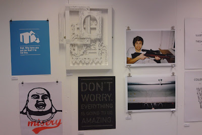
Here are some images of my work from the exhibition. Over all I think the work looks pretty good, I'm particularly proud of my 3D frame piece, all the effort I put in definitely paid off. I can't decide how well I think it goes with the work hung beside it, I don't think it's been done any favours having been surrounded by graphic design but maybe that makes it stand out more? Like I said, I'm on the fence and it wasn't my wall to curate! I'm just being picky.

My Vogue illustration was complimented so nicely on a wall full of photography. It brought variety to the wall and helped break the work up in a manner that was easy on the eyes, and the fact that it was a pencil drawing did this in a very subtle way. I think I made the right choice with framing it as well. The expansive black mount board really draws the eye to the centre of the frame and the softness of the drawing.

Exhibition Day


I feel numb; completely and utterly drained.

Curation:-
I really enjoyed being part of the curation team, me and Claire joined forces to tackle wall #3 - the biggest wall in the far corner of the main studio - and I reckon we earned our keep there. I never expected it to be that difficult! But trying to select 11 pieces objectively that compliment each other and work well as a collection is surprisingly tricky, especially when there's a room full of people trying to do the same - it takes really quick thinking and nimble footwork to nab the best pieces for the job.
Because we were dealing with the first wall that you see when you walk in the room the pieces had to be bold enough and good enough to warrant the audiences attention. We opted for mostly colourful pieces revolving around the large bear illustration which really brought out the warm colours in the other work. We decided on a tapered layout on the wall to direct attention to Steph's photograph, which we thought was the strongest piece on our wall.

Hanging:-
Having a plan is all well and good but erm, where do you start?? Most of our hanging time was spent gawping at the dirty white wall. Then we painted it. Then we gawped again. After some eye glazing and head scratching I made an executive decision to hammer a nail and BOOM we're on fire. Once you have the first piece up it's just a case of constructing the whole thing around it but the fear of getting right to the end and realising that you should have positioned the first piece about 20cm to the left is frankly, at the time, horrifying. Luckily we seemed to have cracked it first time and I think our wall looks pretty amazing! Team Bellia/Gauntley is go.

The weird thing is that whenever any of my friends were looking round I was quicker to point out the wall that we'd curated than my own work in the exhibition. Hmmm need to sort that one out.

Completion:-
The final thing worked so well. The salon style made it work as a whole so much better than individual workspaces ever could. There is the issue of the sporadic composition removing context from a lot of people's work and making it much harder for those 3rd years involved in things like community practice to show off their work but I think the main point to remember is that this wasn't a graduate show - it was simply to exhibit Viscom as a whole, each student had set guidelines to meet for this show and will have the opportunity to exhibit anything outside of those in their graduate exhibition that they will curate themselves. In short, we compromised the minority for the sake of the greater good I suppose. And we made the right decision.


There was so much positive feedback; it felt so good! I physically can't talk about this anymore. Everything hurts and my pillow has never screamed my name louder.

Wednesday, 27 January 2010

One Day To Go...


Wow, what a lovely and not at all stressful day. Oh wait I'm thinking of a day that wasn't today.

Laser Cutter:-
Got there just before 8:30 to make the most of my 9-10am slot thinking that I'd be lucky if I even got one of my larger frames cut out. I'd noticed yesturday that the cutter was going round each line more times than it needed to so I checked the settings of the 'mount board' preset and it was actually having 7 passes on each line... Errrrrm, hello unnecessary. I dropped that down to 3 passes and the difference was incredible. Not only did I manage to get my two remaining frames cut out but I also had time to redo the one I had to compromise due to lack of time. WHY DIDN'T I DO THIS EARLIER?!
So, in short, I got my frames cut out.


Business Lecture:-
I'm going to hold my tongue here.

Prep For Exhibition:-
  • painted all my frames white to make them an identical match to the box frame.
  • bought and attached mirror plates - I definitely think string would have been the choice of a fool.
  • bought a plain black frame large enough to house one of my Vogue drawings without me having to cut them down since I haven't decided the exact dimensions of the pages, and cut some black mount board down to size.
  • cut my post cards down to size - somebody please appreciate how difficult it is to perfectly centre an image that you CANNOT EVEN SEE. Bloody embossing and it's lack of bloody lines.
  • ate lots of food. Pretty sure Paul had a hallucinogenic level of sugar.
  • spent quite a while modifying the layout of my 3D frames, it's really hard to stick to my initial plan because you can't visualise it properly when you're working in 2 dimensions. My original layout plan just didn't work when I had the physical frames there in front of me, so I've adapted the fluid diagonal motion of the layout into a movement that starts at the very back and actually works its way out of the box frame.
  • constructed the whole thing. Took so long. I had to check and double check everything because I'd spent so much time getting everything ready I really didn't want to go hammering a fucking massive nail in the wrong place and screwing it all up. It was also ridiculously time consuming to try and match the height levels of each layer of screws - since I only had 3 variations of screw height some initiative came into play on my part and I had to build up layers with tiny blocks of foam board glued to screw heads
  • try and choose which drawing to put in my collections frame. The 'dash' drawing is so much better in my eyes but I really don't think it has the ability to stand as a single piece - there is no context and it just looks completely random. The 'wonderful' drawing, however, I like comparatively less but because of the hint at the word 'vogue' it will hopefully be much less confusing. I'm still on the fence with this one.. I don't think I'll have a decision until I'm forced to choose at 9:30 tomorrow..
  • helped Paul mount some signage for the exhibition tomorrow.


Complete Failure:-
So... yeah the whole embossing of the leather saga.. I visited Vernon St to see if it would actually be possible to leave my cover in the pneumatic press for a prolonged period of time. Turns out it is not. They've never tried it but they can't guarantee the effect the incredible amounts of pressure will have on the press over such a long time and they aren't willing to risk it. Fair enough. But that does leave me in quite a pickle. I can do one of two things:
  • stick with the leather covering and leave the current, vaguely embossed image to fully relax out so that the box cover is plain - then emboss a loose sheet of black card to act as a cover sheet inside.
  • completely make the whole thing again, scrapping the leather idea and opting for black buckram which we know will hold the embossed image perfectly.
God I hate it when things fail. I got really attached to the idea of a leather bound box, it looks so professional. But with such a large surface area on the cover I literally can't not have anything on there or it will just look amateur as fuck. It really pains me to say this, but buckram it is :(


When I type it out it doesn't sound like a lot but DAMNIT IT WAS GRIM!

Tuesday, 26 January 2010

Embossing

As I had feared my multi-depth postcard idea was a tad ambitious. It could be done, but I would have had to stay there throughout the whole 6 hour acid bath and black out a frame every few hours so that it stopped eroding the copper. That was 6 hours I didn't have. So I settled for the single frame, which to be honest I now think was a better choice anyway - because the embossing is so subtle it would have just been crazy on the eyes if I had too much detail.

I did a test emboss on cartridge paper and it worked perfectly but it was generally a bit flimsy and crap for a postcard - I got on the good stuff: canaletto paper. Worked like a charm, sexiest piece of paper I have ever laid my eyes upon. I made 12 to start off with as the pneumatic press was rather laborious and time consuming - I just need to cut them down to size and they're good to go!

I also created the embossing plate for the cover of my book box. Yey I love spending nearly £15 on copper! Oh no wait, that's right I don't. I used the image with the black text to make the plate, then once the erosion was complete I trimmed the plate down to the black edges of the border to make it easier to align.

I whacked some of my faux leather fabric onto some grey board and did a test run - worked a treat so I stuck the plate on top of my bound cover and threw it in the press. While I was pumping the press up, I noticed that the previously sharp, crisp lines of the embossing on the test piece had relaxed an obscene amount due to the elasticity of the leather. DAMN YOU SPRINGY SURFACES. So I majorly increased the pressure of my cover press and prayed. It came out. All seemed fine. Lovely sharp edges. So I took it away and walked up to Blehiem - by the time I got the the same thing had happened. I spent so long trying to make this look perfect and professional and everything just keeps going down the shitter, fantastic.

It's a really good job I anticipated this and purposely chose not to bind the cover to the tray/lid of the box. This means I can retry next week. I think I need to take a much more aggressive approach to make it permanent - I've done a bit of research and I can't find definitive instructions for faux leather but for real leather to permanently emboss it you need to dampen it, heat it up and leave it in the press for at least 6 hours. So I think an overnight job is in order.

Thomas Chippendale


Since I've spent a lot of time in the 3D workshop recently, I've been talking to the technicians quite a bit. One of them took a look at my work and suggested I look at Thomas Chippendale, an 18th Century cabinet-maker who was commissioned to produce pieces for most of the aristocratic houses of the time. Above is an example of his work in the form of a four poster bed designed for King George III - although it is not a frame, you can definitely see how the intricate detail would be something that could easily influence my work. As my wall piece is focused on really ornate frames it is quite fitting to look at Chippendale's furniture as he was one of the most sought after British designers in an era that thrived on elaborate decoration. Had I known about him before I started drawing out the frames then I suspect my piece would have looked a lot different. I hate how many times this brief insists on kicking me when I'm down.