After some pretty intense brain storming I settled on the concept of 'value' in terms of a designers moral responsibility. In the Enterprise session the other day it came up in conversation that the design industry is the largest consumer of paper out of all the business sectors, which I chose to play on in this poster. I began to come up with ideas around 'designer waste' - designer in the sense of produced by a designer, and also in the sense of being highly regarded, or 'cool'.
All of my thought processes are in my sketchbook, this is just a summary so I appreciate that some things will appear quite random.
For my poster I'm going to be using typography. The main focus will be the phrase 'designer waste' and the fill of the letters will consist of images of the notes/documents/drawings etc that I, personally, have discarded - my designer waste, get it?
Playing around with type layout - I settled on this for the final composition of the text:

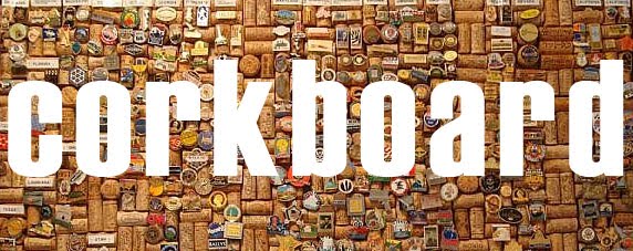
The idea is that each letter looks like this (only better, this is just rough):

Collected my images and used them as fill for the text, I had a limited number of coloured scraps so I decided to use them to highlight the word 'waste', gives it more emphasis and brings it to life a bit more. Still has a dull element to the image here so I've added a drop shadow:


To give it context I plan on including the statistic from my research - "paper manufacturing is the 3rd largest user of fossil fuels worldwide", it has to be inconspicuous compared to the jazzy title. I want the symbol of '3rd' to be the focal point of this text as numerical values and rankings cause curiosity and because the symbol is only 3 characters long I'll be able to have it relatively larger than a whole word or phrase. I'm really struggling with layouts at the minute though, I just can't come up with anything that feels right. The shape of the words just don't seem to fit into any sort of flowing composition.. I think the grey works better than the black though, but then again what do I know? I'm also struggling to settle on the typeface of the sentence. The title letters and '3rd' are Impact (I'm going through some sort of phase?) but I don't know if that's too heavy for the full sentence... Aaarrghhh.


**The grey borders aren't on the actual poster its just the print screen from Photoshop!**
No comments:
Post a Comment