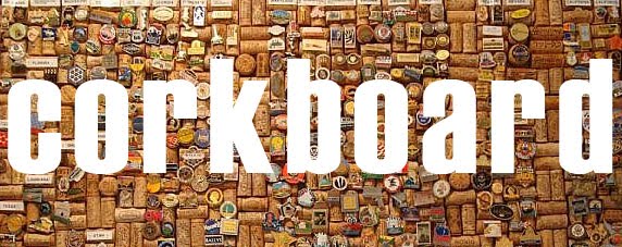
Hopefully my last bit of traditional printing for a while now! I decided to use woodblock type to indicate the use of Holly's photographs in my work. The idea is that this will be the first page of my print book. At the time I found the whole process quite simple and therapeutic, but it's not until I looked at the scanned images that I see how incredibly accurate you have to be with your alignment of letter! When I was taping them together they looked straight, when I set them in the press they looked straight, even on paper I could get away with it at a push but the scans just highlight everything that's wrong with the alignment. Awesome.
It's clear from the images below that the 'raphy' is adhering to some entirely independent axis that uninvitedly reared it's ugly head, and the left-hand alignment of each word is pretty off as well. I still plan on using them as I don't really have time to try again and also I'm not really that bothered about the aesthetics; I can say I've tried it, I understand where I went wrong and I know what I'd do differently so in that sense it's been a success.
Another thing I should have considered is typefaces. Hindsight is a wonderful thing. So at any point did it cross my mind that I should probably have planned the cover text based on the fonts available for woodblock? Quite simply, no. Impact on the front cover. Grotesque on the first page. Forgive me father for I have sinned... It won't look that bad because the whole book will be a mishmash of so many different handcrafted things but Graham would probably take one look at it and flinch. Again, I'm going to play the 'lessons learnt' card and hope for the best.
All in all I found it to be a really enjoyable process but I'm not entirely sure it will have a place in my design. I do love the subtle embossing of the handmade paper but unless I'm specifically looking for that effect then I think screen printing is a much more versatile method of printing typography.

Woodblock on tissue paper - bold crisp lettering, solid ink.

Woodblock on cartridge paper - much more granular, difficult paper texture.

Woodblock on handmade paper - worked surprisingly well, really nice absorbency but unfortunately inked the recesses of the 'y'.
No comments:
Post a Comment